How to Create a Website that Looks High-End
“I just want it to look clean and more professional”.
I have heard this from so many clients after they have taken the DIY route and then finally decide to work with me.
This it’s almost an elusive thing that feels intangible. How do you take your site from looking like a DIY hodgepodge to an elegant design that flows and has clients waiting in line to book with you?
Here are 4 tips that you can start with.
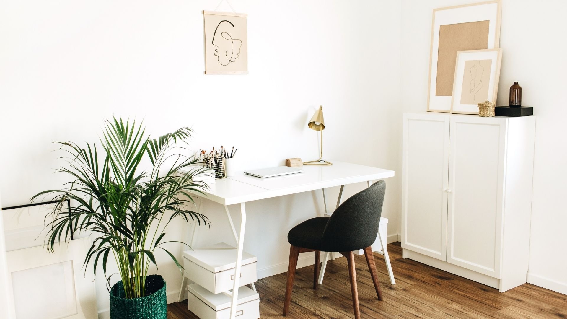
1.Use more white space
So many people who DIY their website think that it needs to be full of written content. For some reason, I have noticed that empty space sometimes makes people uncomfortable. It’s like it’s a sign that they somehow aren’t credible in what they do.
The reality is, white space is so important in creating a site that looks high-end. Without white space, websites feel cluttered and overwhelming to visitors. It’s like they don’t know where to look.
White space actually puts prospective clients at ease and helps guide them to where they should look next.
2. Left align your written content
Centered content looks really nice and elegant at times, but I have seen it used past the point of best practice in many DIY websites. Here is an example:
Option A:
Lorem ipsum dolor sit amet, consectetur adipiscing elit, sed do eiusmod tempor incididunt ut labore et dolore magna aliqua. Ut enim ad minim veniam, quis nostrud exercitation ullamco laboris nisi ut aliquip ex ea commodo consequat. Duis aute irure dolor in reprehenderit in voluptate velit esse cillum dolore eu fugiat nulla pariatur. Excepteur sint occaecat cupidatat non proident, sunt in culpa qui officia deserunt mollit anim id est laborum.
Option B:
Lorem ipsum dolor sit amet, consectetur adipiscing elit, sed do eiusmod tempor incididunt ut labore et dolore magna aliqua. Ut enim ad minim veniam, quis nostrud exercitation ullamco laboris nisi ut aliquip ex ea commodo consequat. Duis aute irure dolor in reprehenderit in voluptate velit esse cillum dolore eu fugiat nulla pariatur. Excepteur sint occaecat cupidatat non proident, sunt in culpa qui officia deserunt mollit anim id est laborum.
Which one is easier to read? Likely, you’re leaning toward Option B. If you are reading on a mobile device, you are definitely going to be choosing Option B.
Make your content easy to read friends! This is a design best practice. Any content longer than 3 lines, should be left-aligned. This helps visitors to read your content more easily and looks much cleaner to give that high-end look.
3. Use professional photos
If you don’t have your own professional photos, you can use some incredible resources like Unsplash or Pexels. Unsplash and Pexels are both commercial-free photo/video websites where you can download images for free to use on your websites.
NOTE: Do not use Google or Pinterest photos, please! Whenever anything is created and posted online, there is an automatic copyright. That means the creator owns the content. Only use commercial-free images or ones you have purchased to own, to prevent getting into trouble later.
IF you choose to take your own (because let’s face it sometimes we don’t have the extra cash) be sure to do the following in your self-photo shoot:
Check your lighting: Golden hour is great in the evening if you want that feel. Same with early in the morning. You want a gentle light that fills the space. Avoid harsh light and be mindful of shadows and use them only in an intentional way to create cool effects.
Be aware of your surroundings: When you take a photo, review it to see what’s in the background. Is there clutter you should clean up? Or maybe something random that shouldn’t be in the background? Finding a clear space that only uses intentional props can make a big difference!
Edit your images: I love to use apps like Tezza and Picsart to make my pictures pop and match my branding. It’s so easy these days to transform your pictures in a way that makes them look like they were done by a pro. And hey, bonus points if you use a tripod for some!
4. Have a clear intention
Avoid throwing content and copy in just to fill space. Make sure everything fills a specific intention. Here are a few questions to ask yourself about the content you are adding:
Will this information serve my ideal client?
Does this content meet at least one of the following criteria?
It builds trust with my ideal client
It highlights the transformation I create for my clients
It helps my ideal client have more understanding for my offer
It builds my credibility
It guides my client to take action
If you can say “yes” to one of more of these questions for the content you add, then by all means put it in!
I hope you found this blog helpful! By following these steps you will be able to wow clients that arrive on your website.
If you have questions or would like to book a free consultation, meet me on the inquiry page!


